Posts

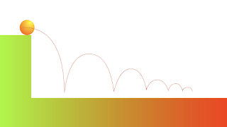
Descending Energy Bouncing Ball
Image
As if another animate assignment wasn't going to be tedious and time consuming enough, I made it even worse for myself by doing an extra 2 hours of work, just to delete it and start over. The" Animate Like a PRO! Bouncing Balls in Flash CS6 " video on YouTube started by showing how to make a bouncing ball with frame by frame animation, which we already learned how to do, but I figured that was the first step of making the arc motion path version...so once the video and I finally finished the frame by frame animation of it (about 100 frames), the video then started over to show how to make it with an arc motion path, and I was pissed. I then spent another 3ish hours making the arc motion path and tweaking the arcs and adding and removing frames until I finally had a natural-ish looking bounce. Not one of my brighter moments.

InDesign: Sunglasses Ad

Image
I realized I never uploaded this project to the blog, and since it's the work that I'm most proud of, I had to add it. 

Perpetual Double Ball Bounce

Image
I did this one right after doing the original perpetual bouncing ball, so it was much easier and quicker and even looks better with the gradients and such. I didn't mind this assignment at all.

Perpetual Bouncing Ball - Animate

Image
Here's my perpetual bouncing ball that I made the week before spring break. Thank God for people showing how to do these on YouTube.  No angst from Jacob.

InDesign Menu--Marker Comp

Since I'm going to be in New Mexico for the entire spring break period, I had to take all of my pictures early (last Sunday because that was the only day this week that it was actually sunny). I was stressed out of my mind on Sunday trying to get all of the pictures while it was still sunny, and felt like crap after eating all of the random fast food items I had to buy and take pictures of for this, but once that nightmare was over, the marker comp part of the assignment got a lot easier because I already had all my pictures taken. As Rusty said, I "did it ass backwards." I had fun being creative and making the marker comp layout and I'm excited to make the actual thing on InDesign now. And, I'm finding great use of my stock bulldog photos I have from my girlfriend's brother's dog so I'm excited about that too.

My Favorite Ride--Finished

Image
Here's my finished product. It's not perfect, I didn't realize how much I screwed up the outline around the grill (an opacity/layers issue) until it was printed out and too late, but other than that glaring deformity I'd say it turned out pretty well. I spent at least 10 hours on this thing so I'm glad it'd done. If nothing else, it looks a lot better than I thought I could make it look so that's a plus.

My Favorite Ride on Illustrator

I've spent an hour or two a day all week working on this project, and I'm not done yet but I'm very pleased with how my 2009 Honda Civic is turning out. It's been a ton of layers and gradient fills over each other and massaging and teasing with the bezier curves, and now all of a sudden it's actually starting to look like my car and I'm pleasantly surprised by that. I'm still wrestling with how I'm going to make the metallic silver grill and headlights look shiny, but Rusty told me this morning that the only way to to it is to make a bunch of layers with different brightnesses and opacity, and that (sadly), there's no button to press to "make it look pretty." That's my suggestion to Adobe for their next update/software: a button or a filter that makes the object look pretty. There seems to be a button for everything else, so I'm sure it's possible. Stay tuned for a follow up post that shows my finished product of the one and onl